


Overview
In this documentation, we've gathered all the useful information on how to add, use, and customize the Kohorta Narration module on your page in HubSpot CMS.
Features
Kohorta Narration module allows:
- Applying animation to text of any length
- Choosing between extremely efficient predefined graphic elements: square, circle, burst, heart, diamond, etc.
- Controlling the speed of the text reveal animation
- Customizing spacing, colors, fonts, and alignment for all the elements
Benefits
Kohorta Narration module:
- Increases time spent on your webpage by grabbing and guiding the viewer's attention
- Levels up your website design with animation for static text
- Brings a storytelling feel to your webpage that strengthens your brand
- Keeps people on your website longer, which means they are less likely to go to your competitors
Setup
To add the module to your page, go through the following steps:
- Log in to your HubSpot account:
Go to the HubSpot homepage and log in with your credentials. - Navigate to your pages:
From the main dashboard, go to your pages section. This might be under 'Marketing' > 'Website' > 'Landing Pages' or 'Site Pages' depending on the type of page you are working on. - Edit or create a new page:
Select the page you want to add the Narration module to, or create a new page. In the page editor, you'll have a layout where you can add modules. - Find the module:
In the page editor, there should be a plus icon on the left. By clicking it, you open a list of assets to add. At the top, find an input field and type in "Kohorta Narration" to reveal the module in the search results. - Add the module:
Select the module in the left pane and drag it onto your page on the right, wherever you like to have it. Usually, the common placement would be somewhere at the bottom of the page.
Settings
The module has two main setting groups: Content and Styles.
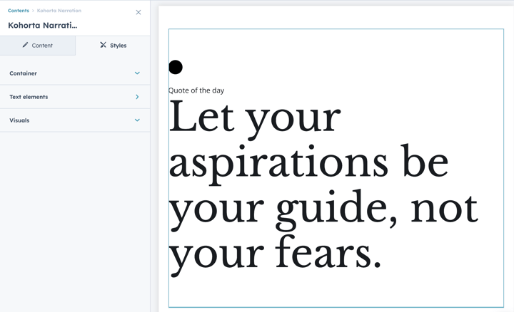
Content

- Text elements:
The group consists of simple text fields for a static top label and text to animate. - Visuals:
The group consists of the on/off switch of the element and a list of graphic symbols: square, circle, diamond, hear, burst, cone, flag, infinity. - Animation:
The group allows animation speed — default, slower, and faster — to be set for the main text to animate.
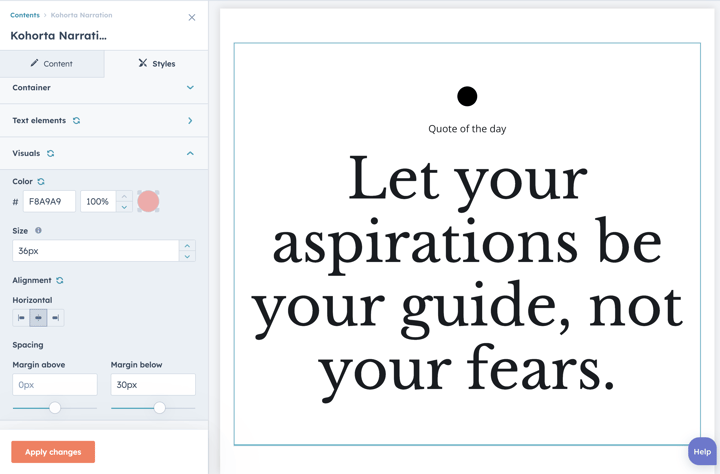
Styles
- Text elements:
Label and Main Text are the text elements. They are grouped separately in the Styles tab but have similar style options to edit:
- font settings (family, size + responsive size options separately for mobile and desktop screens, color, style);
- spacing (margin and padding);
- alignment (left, center, right, justify). - Container:
These are the settings of the module's main container that allow editing:
- background color;
- spacing (margin and padding);
- content width;
- responsive settings for content width (tablet and mobile separately from the desktop);
- min-height height for special cases. - Visuals:
These are the settings of the module's graphic element that allow editing:
- color;
- spacing (margin);
- size;
- alignment.
Reminder
Whenever something has been changed in the module settings, click 'Apply changes' button at the bottom to have the changes displayed on the page.
Bonus: Advanced features
For those who fancy a more advanced look and feel, we offer premium customization that can turn your marketing messaging into powerful storytelling similar to this example:

Excited about this feature or thinking about something different? We are here to make it happen. Just drop us a message 👇